Introduction
You may have heard the term “Pantone” thrown around in creative circles, during boardroom presentations, or even while discussing home décor. But what are pantone colors? For many, it’s a term that hovers in the peripheral vision but is seldom understood.
However, in industries that rely heavily on color—from design and marketing to manufacturing—Pantone serves as a universal language that streamlines the process and ensures impeccable outcomes.
This article aims to demystify Pantone colors, diving deep into what they are, how they’re created, and the numerous applications they serve across various sectors.
What are Pantone Colors?
You’ve likely encountered Pantone colors in various aspects of design or even marketing. Pantone is a color matching system developed by the Pantone Corporation, a U.S.-based company that has set the industry standard for color since its inception in 1963.
The system allows for the standardized reproduction of color. This is of utmost importance in design and production processes where color consistency is key.
The Pantone Matching System (PMS)
The Pantone Matching System employs a unique code for each color in its palette, like “PMS 300” for a specific royal blue shade. These codes are universal, meaning a PMS 300 in London is exactly the same as a PMS 300 in Sydney or San Francisco. This allows for a level of consistency that is hard to achieve with other color systems like CMYK or RGB.

The Science Behind Pantone Colors
Ever wondered how Pantone colors maintain such consistency? Unpack the science and methodology that make Pantone an industry standard across the globe.
Base Pigments
Its colors are derived from 13 base pigments, which are mixed in specific amounts to produce a wide spectrum of colors. These pigments are mixed based on predetermined formulas to ensure that each color is reproduced accurately, every time.
Guides and Chips
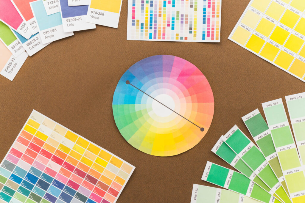
To further assist with the selection and matching process, Pantone provides physical guides and chip books. These include swatches of each color, often with coated and uncoated variants to show how a color will appear on different surfaces.

Industries That Rely on Pantone Colors
The usage of this color system isn’t limited to one or two sectors. Here’s a look at how various industries employ this universal color language:
1. Graphic Design
The Pantone system for graphic design is indispensable for creating visual identities, especially in branding and logo design. A specific Pantone color ensures that a brand’s visual elements are consistent across different media.
2. Fashion and Textile Industry
The Pantone system is a significant tool for fashion designers who need to communicate specific color choices to manufacturers. This ensures the fabric colors in their collections are consistent, down to the exact shade.
3. Manufacturing
In manufacturing sectors, especially those that involve the production of goods like cars or appliances, Pantone serves as the standard for paint colors and other finishes. This ensures that all parts, even those produced in different locations, match perfectly.
4. Interior Design and Architecture
The Pantone system in interior design and architecture, this color system guides decisions on everything from wall paint to furniture upholstery. The system’s broad range of colors provides a versatile palette to work with, making it easier to bring design visions to life.
5. Marketing and Branding
In today’s highly competitive marketplace, brand consistency is more crucial than ever, and color plays a significant role in that. Marketers rely on this color system to ensure that their brand’s colors are consistent across digital and print media.
Expert Tips for Using Pantone Colors
- Consistency is Imperative: Always record the Pantone numbers you are working with so that future reprints or related projects match perfectly.
- Material Matters: Different materials can display the same color in varying ways. Keep this in mind when choosing Pantone colors for diverse mediums.
- Digital Isn’t Always Accurate: Screens can distort color. Always cross-reference with physical Pantone guides for an accurate representation.
- Teamwork Makes the Dream Work: Effective communication is key. Always specify the Pantone color codes when dealing with vendors, clients, or team members involved in your project.
- Testing is Crucial: Whenever possible, run a small-scale test to ensure that the color output in the final product is to your satisfaction.
Conclusion
Pantone colors serve as the backbone of various industries, offering a universal language of color that ensures consistency, accuracy, and quality. Understanding this color system is not just useful for professionals in design or manufacturing but is valuable for anyone involved in projects where color matters.
With its standardized approach to color, this color system eliminates guesswork, enabling your ideas to shine in the true colors you envisioned. By delving deep into the world of Pantone, you’re arming yourself with the knowledge to make informed decisions that can significantly impact the final outcome of your projects.
Sphere Sport is a sportswear & sports uniform manufacturer based in China. We specialize in serving teamwear brands in the US, Australia, and the UK.
Contact us today about any of your sports apparel manufacturing needs.


